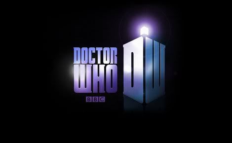
Like just about every other aspect of “Doctor Who” (aside from, perhaps, the basic design of the TARDIS exterior), the logo for the series has gotten an overhaul once again. The above images were released today, but won’t be seen onscreen until 2010, with the arrival of Matt Smith as the new Doctor. One can only assume that these are two different logos, and that they will be used for two different purposes. I’m by no means a graphic designer, but right off the bat I warmed to the primary logo, if for no other reason than because the word “Doctor” is placed over the word “Who,” which for me is always how it should be. The “DW” that forms the shape of the TARDIS is also a particularly ingenious bit of branding, especially in this internet age where most everything is reduced to initials for geek-speak purposes anyway.
I was never a huge fan of the current logo, and especially the plain font that’s been used for the past four years, but since the production team did such a bang-up job with the credits sequence, it really didn’t matter. And there’s the rub: If you’re not sure about this new logo, wait and see how it’s used in the credits sequence, because you can bet that along with the new logo, we’re also going to get a whole new set of opening titles, very likely designed around a new arrangement of the theme tune.
To quote the 6th Doctor from the end of “The Caves of Androzani”: “Change my dear – and it seems not a moment too soon.”
Here’s a gallery on the official BBC site that has the new logo available for download for desktop wallpaper purposes.

